Rebuilding Coalition's quoting flow: seven countries later, the information architecture has barely changed
Coalition already knew this tool had to be migrated and extended, so the project was going to happen. What was not guaranteed was that one system would satisfy every goal at once and still hold its shape two years later. It did, and it became the largest internal product launch in the company's history.
Team. Four product managers, engineering, and a junior designer I mentored, who produced screens in the later phases. I had two years on the tool this replaced, so the audit started from what I already knew was broken. I owned discovery, the interaction model, concept testing and the M1 versus later scoping calls, and stayed the sole designer on the flow through 2025. Engineering owned the resolution logic, and I pressure tested feasibility with the lead front end and backend engineers before committing to a model rather than after.
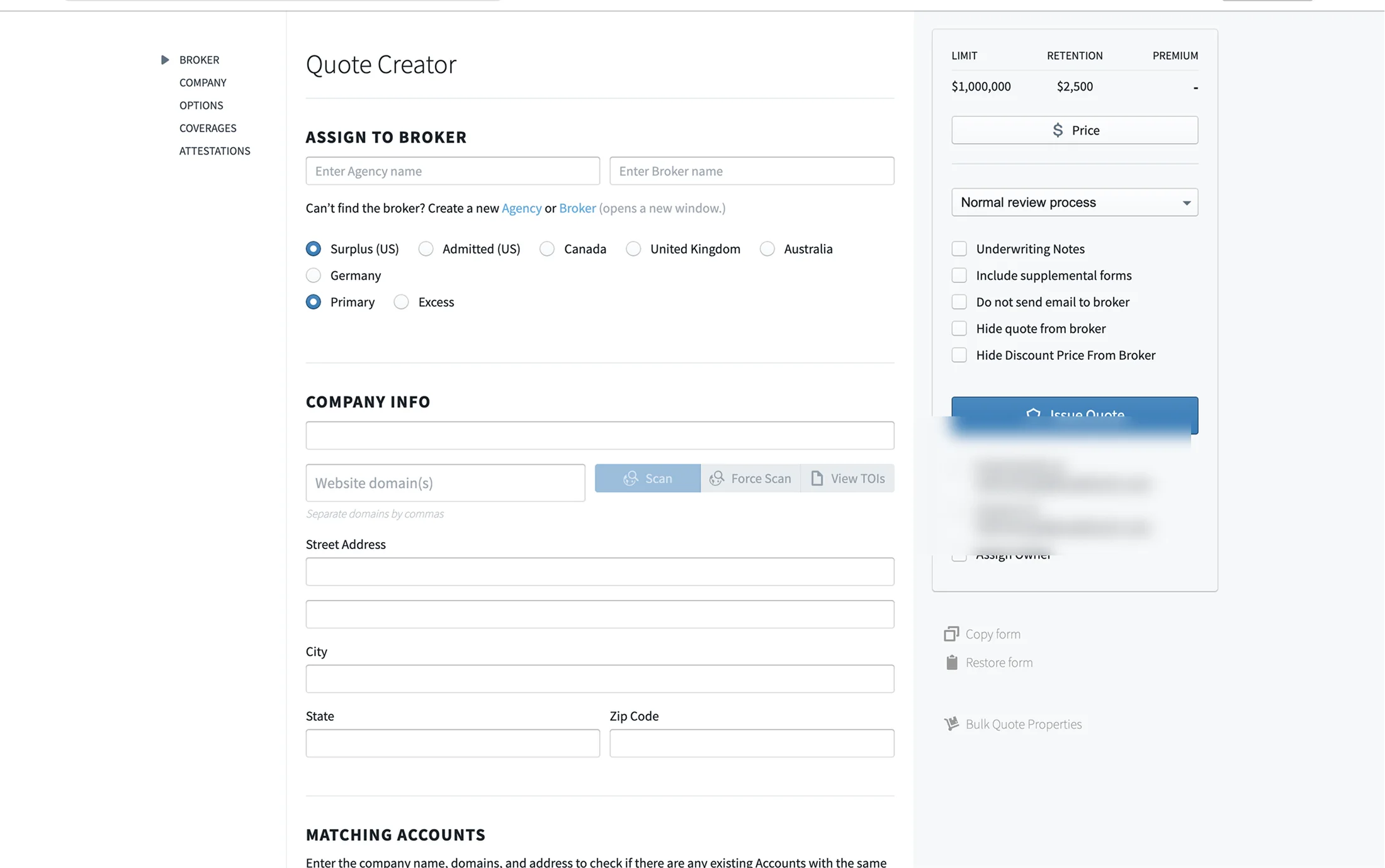
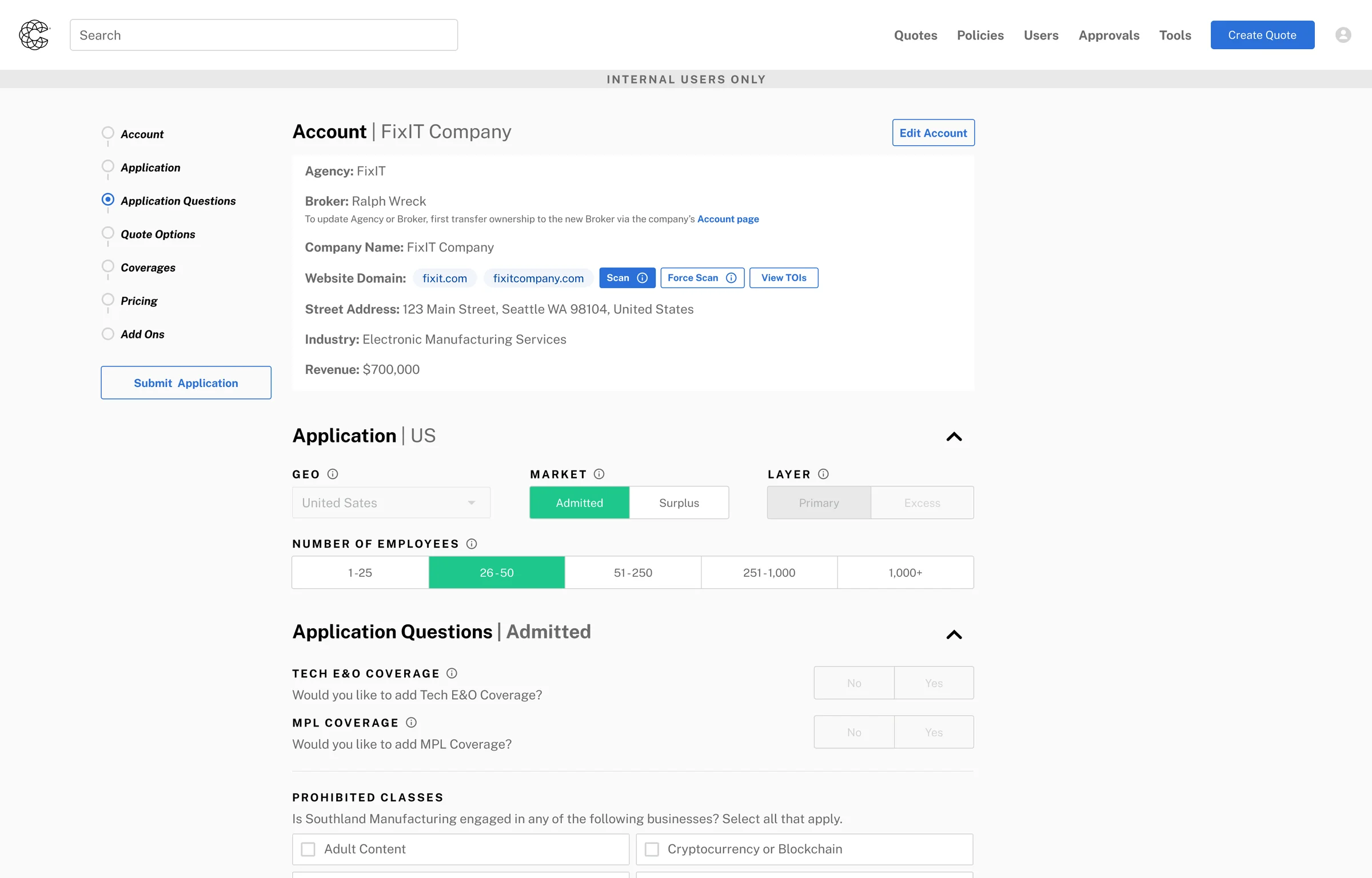 Before
After
Before
After
Coalition's quoting tool was old. It ran on a design system the company was leaving. Every new insurance market had to be hardcoded by engineers. Brokers and internal staff used two different front ends that drifted further apart every sprint. The people quoting every day had built years of workarounds around it.
Everyone knew it had to be rebuilt, so I did not have to sell the project. The default plan was to rebuild it as it was, on the new design system. I argued for something else: take the variability out of the layout and put it in the data.
That is the whole idea. The stages never change. What appears inside them is worked out at runtime from what the system already knows about the account. Adding a market became a data job, not a design job. Seven countries, another team's account matching work, and the Allianz book have all landed on it since without the structure changing.
The full case study is below, including the four decisions, the one I lost, everything the flow absorbed afterwards, and what I would do differently.
Read the full case study ↓There is one more: Coalition's first AI product, shipped in three months →
The migration was already agreed. The shape of it was not.
Coalition roughly doubled in headcount while I was there, and the quoting tool arrived at three problems at once. It ran on blueprint.js, which the company was moving off. Its questions were written into the page, so every new market and line of business landed as another hardcoded variant. And brokers and internal users sat on two separate front ends that drifted a little further apart every sprint.
The screenshot below shows how far that had gone. The market row already carries radio buttons for Canada, the United Kingdom, Australia and Germany. None of those businesses were live. That is what hardcoding markets into a page produces: options that exist in the interface before they exist in the company, each one a branch somebody has to keep working, and none of them any use to the person quoting today.
None of that was news, and this is the part worth being straight about: I did not have to argue the project into existence. Leadership already knew the tool had to be migrated and had to extend, and it was funded on that basis. The open question was what to build. The default answer, a like for like rebuild on the new design system, would have closed the migration goal and left the other two exactly where they were.
Meanwhile the people using it every day had absorbed the cost themselves. Years of workarounds, tabs open to other parts of the tool, and quotes recalled after submission because something upstream had changed underneath them.
Four audiences, four definitions of a good quote
- Brokers on the external platform need the same information internal teams see, or the two answers diverge.
- Customer success wants speed and fewer decisions to make.
- Underwriters want control over pricing, which means more decisions, not fewer.
- Risk engineers want the whole picture fast, and do not want to build it a field at a time.
A flow tuned for any one of them is wrong for the other three. That conflict is the reason the answer was adaptive resolution and not a better form.
How I reframed it
How do we reimagine the quoting flow as a guided intelligence layer, not just a form?
One that surfaces the right information at the right moment, adapts to what it already knows about the account, and gives our users a live signal on where the quote is headed before they ever hit submit.
The questions at the bottom of the form were inputs, not paperwork
I already knew the domain, so discovery was about testing assumptions rather than learning them. I audited every question in the flow against one test: what does the answer change?
That is where it broke. Attestation and application questions sat at the bottom, in the position you put paperwork. They were not paperwork: their answers decided which coverages appeared and how pricing calculated. Asking them last meant the whole session ran on inputs that did not exist yet, which is where the recalls came from.
My first explorations were smaller: simpler account creation, one question at a time, tighter sequencing. They tested well and solved none of it, because they left customization, pricing overrides and the extension problem exactly where they were. Killing that direction is what made room for the real one.
Principle 01
Make value apparent early
Do not ask users to bank their goodwill against a future reward. Experienced users had years of muscle memory in the old tool, so each change had to pay for itself on the screen where it appeared.
Principle 02
Guide, do not overload
Behave like a knowledgeable colleague. Infer geography from the broker's region. Surface only the coverages relevant to the account. Anything the system can resolve on its own is not a question worth asking.
Principle 03
Ask with purpose
No input without a visible payoff. If a question appears, the user should be able to see how the answer shapes what comes next. This is the principle that made the whole model possible.
I moved the variability out of the layout and into the data
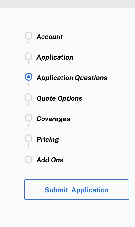
The stages are fixed: account, application, application questions, quote options, coverages, pricing. What appears inside them is not. Questions resolve at runtime from what the system already knows about the account, and geography comes from the broker's region instead of a dropdown. Admitted and surplus stopped being two versions of a screen.
Two years on the old tool meant I knew which of its rules were real and which were only habit. And I worked this out with the engineers rather than handing them a finished design, because what the screen shows and when it shows it is their problem before it is mine. Design it first and ask later, and the flexible part becomes a second project a year on. Second projects rarely get funded.
Adding a market stopped being a design task and became a data task. Someone adds a question set. No new screen, no new branch, no designer.
Interactive: one flow, four quotes
The stages never change. What resolves inside them does. Switch market and line of business and watch which rows move.
Arrow keys move between options.
A diagram of the idea, not the product. The shared questions hold their position while the market specific ones move around them.
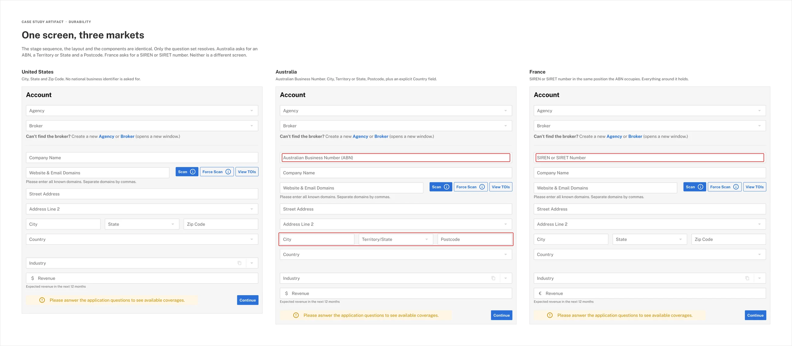
What the old flow would have needed instead
Old model: add a market, add a screen
Quote page, US Quote page, US surplus Quote page, UK Quote page, Germany Quote page, Australia and one more, every timeEither a second quoting page maintained alongside the first, or a growing stack of conditionals inside one page that nobody could safely change. Both routes end with the broker and internal experiences drifting apart again, which was the reason the rewrite existed.
New model: add a market, add a question set
One stage sequenceresolving against
Question set, US Question set, US surplus Question set, UK Question set, Germany Question set, AustraliaThe sequence stays one thing. The column beside it grows. This is the entire difference, and it is why seven countries have landed since without a redesign.
Four decisions that shaped the flow
I won the first three. I lost the fourth.
Decision 01 · The order of things
Application questions moved to the front, and the account locked behind them
Moving them was the easy half. The hard half was what it forced: if pricing resolves from answers given early, then everything downstream has to be able to trust that those answers are stable.
So I made account identity a stage rather than a row. The old tool matched accounts with a bare row of results inside the form. I gave it its own screen and wrote the rule into the flow: account information locks once you cross it. That annotation went onto the flow diagram before anyone knew how much it would end up carrying.
The cost is real and I will not pretend otherwise. Locking the account is a constraint users feel. It is the price of a flow where the quote in front of you is the quote you are actually going to get.
Old order
- Account information
- Quote
- CoveragesOptions
- Contingencies
- EndorsementsAgency Programs
- Discounts
- Attestation Questions
- Country Specific Questions
- Tech E&OMPL
- Submit
Chosen order
- Account information
- Locks account information once this is crossed
- Attestation Questions
- Country Specific Questions
- Quote Cyber
- CoveragesOptions
- ContingenciesEndorsements
- Additional Coverage Questions
- Tech E&OMPL
- Extras
- Agency ProgramsDiscounts
- Comp IntelCommission Overrides
- Submit
Decision 02 · The pricing module
The pricing module stopped being there when it had nothing to say
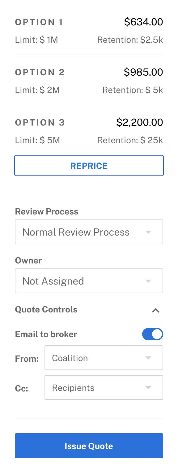
In the old tool the pricing module sat in the right-hand column from the second you opened a quote. It showed a limit, a retention, an empty premium, and a live button offering to issue a quote it could not price yet. It was on screen for most of the session with nothing true to show, so people stopped looking at it.
Once attestation questions moved to the front, the fix was almost free. The module now appears when the answers that drive pricing exist, and not before. It is the same rule as the question ordering, applied to the one part of the screen that had been exempt from it.
Then it had to earn the space. The rebuilt module prices up to three options side by side against limit and retention, reprices in place, and absorbed the controls that used to be scattered: review process, quote controls, account owner, and the email controls, so whoever issues the quote sets who sends it, who is copied and who owns the account without leaving the screen. This module took more design time than any other single component in the project.
Before
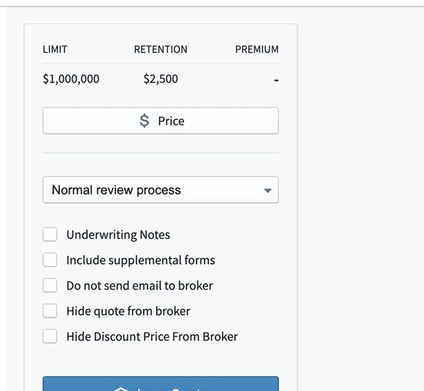
After
Decision 03 · Validation
I held the line on inline validation and scoped it by ticket volume
End of section validation, flagging every error at submit, was simpler to build and matched the old tool. Inline validation needed field level state handling and more engineering coordination, and it was the direction research kept pointing at.
Rather than argue it as a principle, I made it a scoping problem. Customer success shared their support ticket data, and I used it to rank fields by how often they actually generated errors. Not every field got inline validation in the first release. The highest frequency surfaces did.
Post launch error rates confirmed the ranking. That is also the argument I would use again: a contested pattern is much easier to win as a prioritized subset than as a principle.
Decision 04 · The one I lost
I lost the argument on answering attestations in place
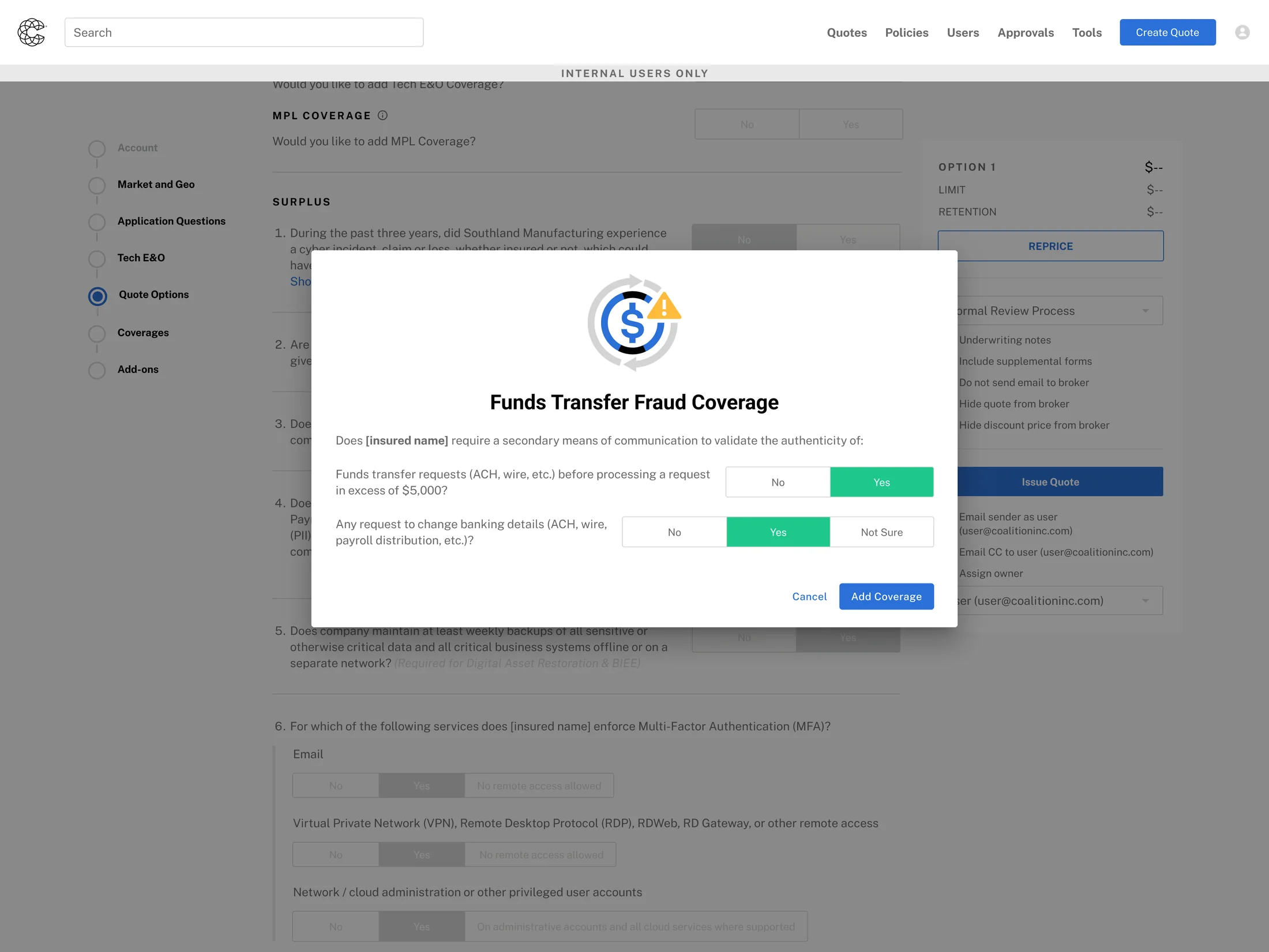
Moving attestation questions to the front had a cost, and it showed up twice. Change an answer late and the quote has to resolve again, which in the shipped design means resubmitting the application. And some coverages carry their own attestation questions, so adding a coverage late triggers exactly the same thing: answer the question, resubmit the application.
My proposal was a modal. Ask a coverage's attestation at the moment the coverage is added, answer it in place, and let the quote resolve without sending the whole application back. Same idea for changing an answer that already exists: edit it where it is, no resubmit.
Engineering scoped it and the answer was no for the first release. The field level state handling it needed was more than M1 could absorb, and it went onto the roadmap. I still think it was the right call for the user and the wrong call for the release, and those are allowed to be different answers.
What I negotiated in exchange was a single control pinned under the left navigation, in view at every scroll position. It carries one of two actions depending on the state of the application, Edit or Submit, never both at once, so whatever the flow will actually let you do next is the thing on screen. A user who changed an answer late did not have to scroll the length of the application to act on it. Smaller than the fix I wanted. It removed most of the cost.
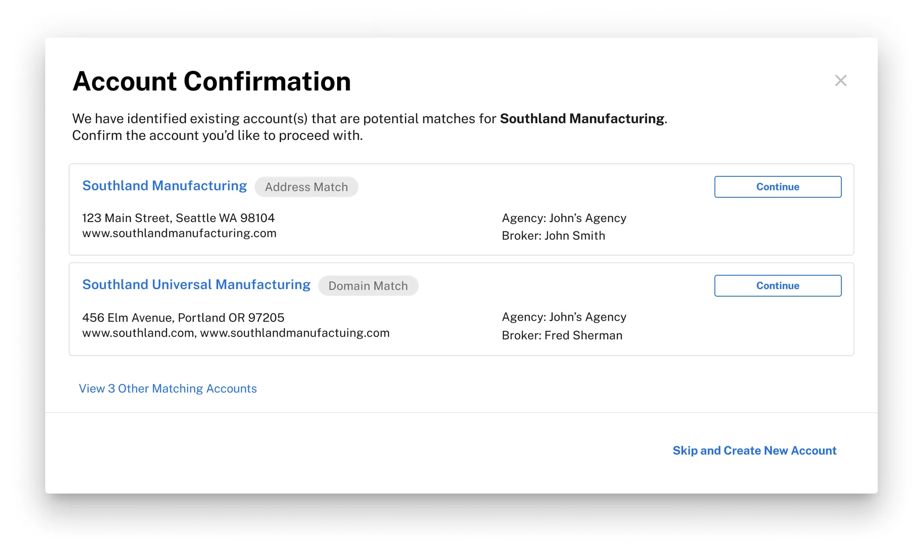
Account matching went centralized across three platforms, and the stage held
The test came two years later, when Coalition decided account matching should be solved once across the company rather than separately inside each product. I was handed that work.
Making account identity a stage was worth something immediately. Duplicate account creation fell from 36.3% to 23.1% at launch, because the flow now had a place where identifying the account was the only thing you were doing.
Centralizing it was a far harder version of the same problem. Best match against attribute match. Multiple domains. An active broker of record on cyber against excess risk. A single line against all lines. The same agency with multiple brokers. Multiple lines across multiple agencies and brokers. Multiple match states where the original design had one, plus a feedback loop asking users to correct the matching itself.
It went into the account stage rather than around it, and it went into three platforms rather than one: the broker platform, Executive Risk and Cyber. Duplicate account creation fell to a 41% total reduction.
Doing it myself makes this a harder test, not an easier one, because I was the person who would have had to redesign the account step if it had not held. It held, so I extended it instead. The pattern I drew for one product is the one three platforms now use.
Duplicate account creation at launch, once account identity became its own stage.
Total reduction after centralized account matching shipped into that stage, two years later.
Platforms matching accounts on the same pattern: broker, Executive Risk and Cyber.
What the added states look like


The scale test, arriving now
In May 2026 Allianz Commercial announced it is transferring its standalone commercial cyber portfolio to Coalition and making Coalition its exclusive global cyber partner, phasing in through the US, UK, Australia, Germany, Denmark and Sweden.
Look at that list against the countries already quoting on this flow. The UK, Australia, Germany, Denmark and Sweden are on both. The book is phasing into markets the flow was already resolving question sets for, which is the difference between a partnership that needs a platform built for it and one that can start.
The deal is not mine. The internal tooling it lands in is: core platform design was my remit by then, so making the platform take that book came to me. It has not required the information architecture to change much. That is the argument of this page, tested at a scale I never designed for.
What shipped, and what happened after
The redesigned flow moved every metric we tracked. Quote recall errors dropped 80%, duplicate account creation fell by a third, and users saved an average of three minutes per quote.
It became the largest internal product launch in Coalition's history. Every internal user moved to the new tool, and the legacy tool stayed running the whole time. Nobody went back to it. That is the outcome I care most about, because it is the only one that could not be mandated.
It also closed the goals it was funded to close. The flow moved onto the new design system, and the broker and internal experiences stopped diverging. Since launch, Canada, the United Kingdom, Australia, Germany, France, Denmark and Sweden have all gone live on it with minimal design rework, which is the clause I was actually designing for.
At a glance
What it unlocked next
The flow became the blueprint for the work that followed: pricing overrides, endorsements, competitive intelligence, agency programs and commission overrides. Each of those used to mean navigating away from the tool. Each of them landed as another thing the stage sequence could hold.
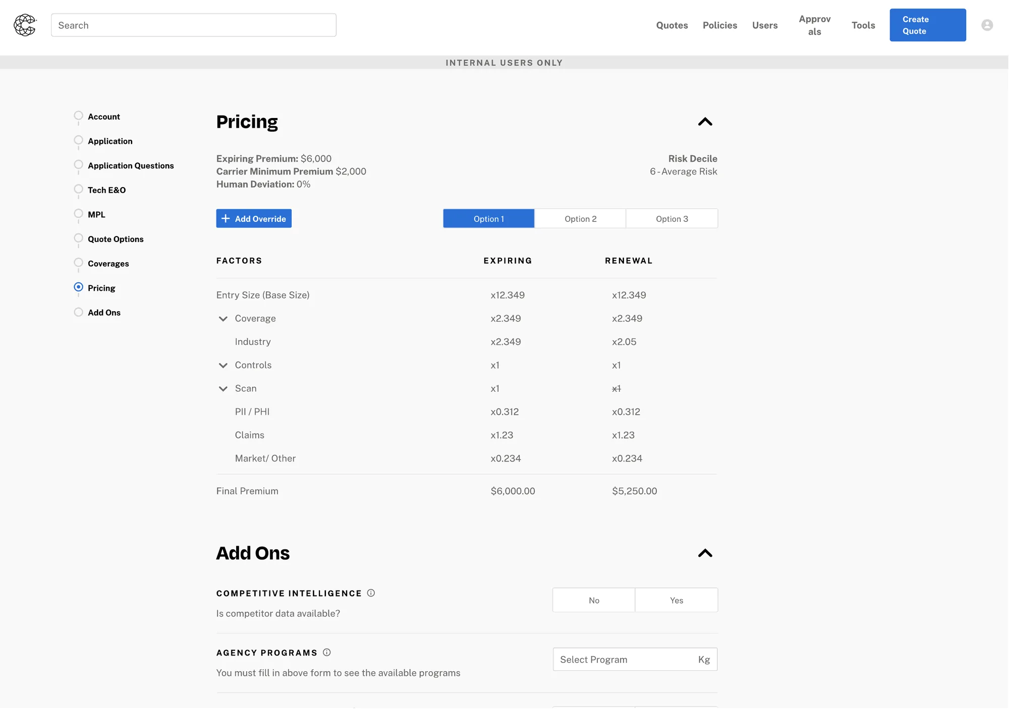
The reissue recap: what changed since last year, read in place
A reissue is a quote for an account that already had one. Over a year the account moves. Coverages get added, endorsements get removed, contingencies appear, and the application itself migrates to a newer version. Finding out what had changed meant leaving the quote and going into quote details, which is exactly the kind of trip the rebuild existed to remove.
So I put the difference at the top of the quote. What was added, what was removed, which application version it migrated to, and why it has been flagged for secondary review, in the place the work is already happening. It holds a lot for its size, so the long lists sit behind a disclosure and it opens compact.
This shipped in 2025, well after launch, and it is the clearest thing the stage model bought. A concept that did not exist at M1 arrived as content inside a stage that was already there. No new flow, no new navigation, no redesign.
Re-issue recap
Secondary review reasons
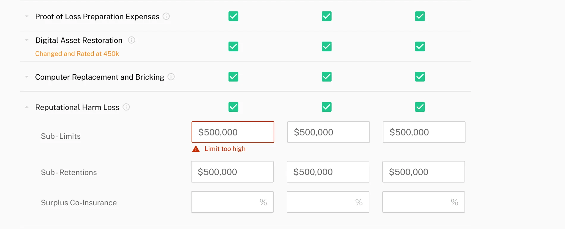
↑ Limit too high for Coverages
- Bodily Injury and Property Damage, 1st Party
- Bodily Injury and Property Damage, 3rd Party
- Breach Response
- Business Interruption and Extra Expenses
- Computer Replacement
- Crisis Management and Public Relations
- Cyber Extortion
- Digital Asset Restoration
- Funds Transfer Fraud
Application Version: Automatically updated from Surplus 2.0 to Surplus 3.0
- Coverages
- Added: Funds Transfer Fraud, Tech E&O, MPL
- Removed: Pollution, Reputational Harm Loss
- Endorsements
- Added: Invoice Manipulation Endorsement
- Removed: Reputation Repair Endorsement, Wrongful Collection Exclusion
- Contingencies
- RSA Request
- MFA Remote Access
What I would do differently
I scoped inline validation by ticket volume, which was right, and then did not scope the error copy with the same rigour. Handlers hit correct validation with unhelpful messages and called support anyway. We fixed it after launch. It should have shipped in M1, and the miss is instructive: I treated the decision as a systems question and the words as a detail, when the words were the part the user actually met.
I also under invested in migration communications. Adoption was strong, but the first week generated avoidable questions that a single annotated walkthrough would have absorbed. On a launch this size, the walkthrough is part of the design, not an afterthought.
Next case study
Automating Coalition's support queue: four out of five AI proposals used without an edit
Coalition's first AI product, shipped in three months. A 1,500 ticket a month queue taken to 65% end to end automation.