Automating Coalition’s support queue: four out of five AI proposals used without an edit
Coalition’s first AI product, shipped in three months. It took a 1,500-ticket-a-month queue to 65% end-to-end automation at peak, then expanded into three more ticket types, and the pattern behind it now runs in three teams.
Team. One engineering partner, the platform engineering team, and Coalition’s customer success leads. I owned discovery, the interaction model, the autonomy criteria and the measurement plan; engineering owned the extraction pipeline and the model itself.
NEW INTERACTION
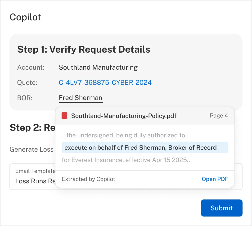
Hover-to-source showed the source of truth right inside the Zendesk panel. A machine assertion and the evidence for it, in the same panel.
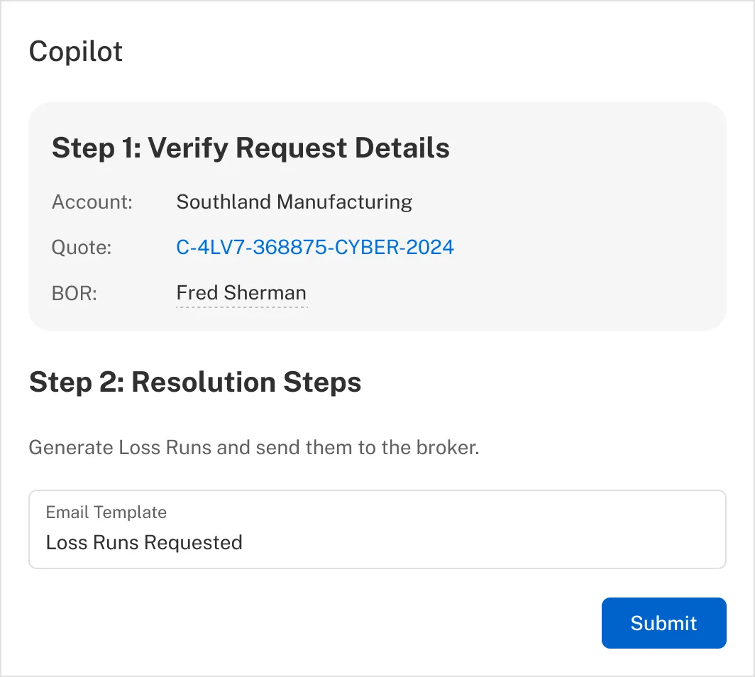
The whole product in one frame. The panel proposes, the snippet proves, and the agent stays in the ticket.
Coalition’s customer success team was absorbing roughly 14,000 Zendesk tickets a month, growing 50% year over year against a headcount plan that was not. Loss runs were 10% of that queue: 1,500 tickets a month, five minutes and seven tool switches each. Mechanical enough to automate, and risky enough that getting it wrong meant a broker receiving an incorrect document.
The hardest decision was not what the AI should do. It was what it should be allowed to do without asking. I designed Customer Success Copilot around a runbook: before acting, it shows the task it intends to perform, the data it extracted, the internal actions it plans to take, and the reply it drafted. The agent approves, edits, or ignores it. Nothing happens silently. Full autonomy is unlocked per scenario, behind eligibility criteria I defined with engineering, rather than granted to the system as a whole.
That structure is why the numbers held. At launch agents applied the proposal unedited roughly 80% of the time, which says the suggestions were good enough to use as-is rather than merely fast. The runbook then generalized past its original use into bind requests, signature bundles and renewals, and it now runs in three teams: customer success, where it was built, plus claims and the underwriting workbench, the last two building AI features I had nothing to do with.
The full case study is below, including the decision I got wrong, before getting it right, thoughts on the measurement framework and my reflections.
Read the full case study ↓There is one more: Coalition's quoting flow, seven countries later →
The decision: proving the model was right in 452 pixels
Every trust affordance had to fit the same 452 pixels of Zendesk sidebar, so proving the output competed directly with doing the work.
First we chose to let agents correct, not confirm
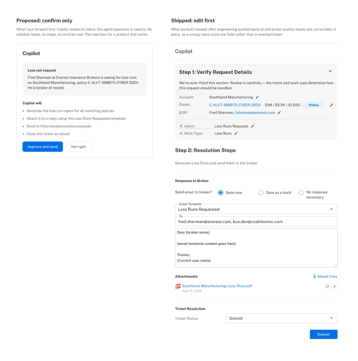
What I proposed first was simple. The runbook would show what it intended to do and the agent would confirm it. One screen, one judgement, minimal chrome. It was the interface for a product that works.
My engineering partner pushed back, and she was right to. The LLM and the extraction quality we had access to at that point could not carry it. A confirm-only interface has no graceful middle: when the model gets something wrong, there is nowhere to go except reject the whole runbook and start over by hand. Ship that against a model at the accuracy we actually had and you teach agents that a failed runbook means a manual ticket, which is the fastest way to lose their trust and never get it back.
So we built it the other way. Agents were dropped straight into an editable state, with the extracted inputs, mainly the policy number and the account, correctable in place. It also worked. Correcting one field is a far smaller tax than reverting to manual, and the product survived a period when the model on its own would not have.
That decision created the next one. On loss runs the thing an agent had to verify was an account, which the panel could show plainly. When we extended to bind requests and signature bundles, the thing to verify was a signature inside a long document, and there was no plain way to show that in 452 pixels. Everything below came directly out of a design that had made verification the agent’s job.
The panel was 452 pixels wide and had no guaranteed height
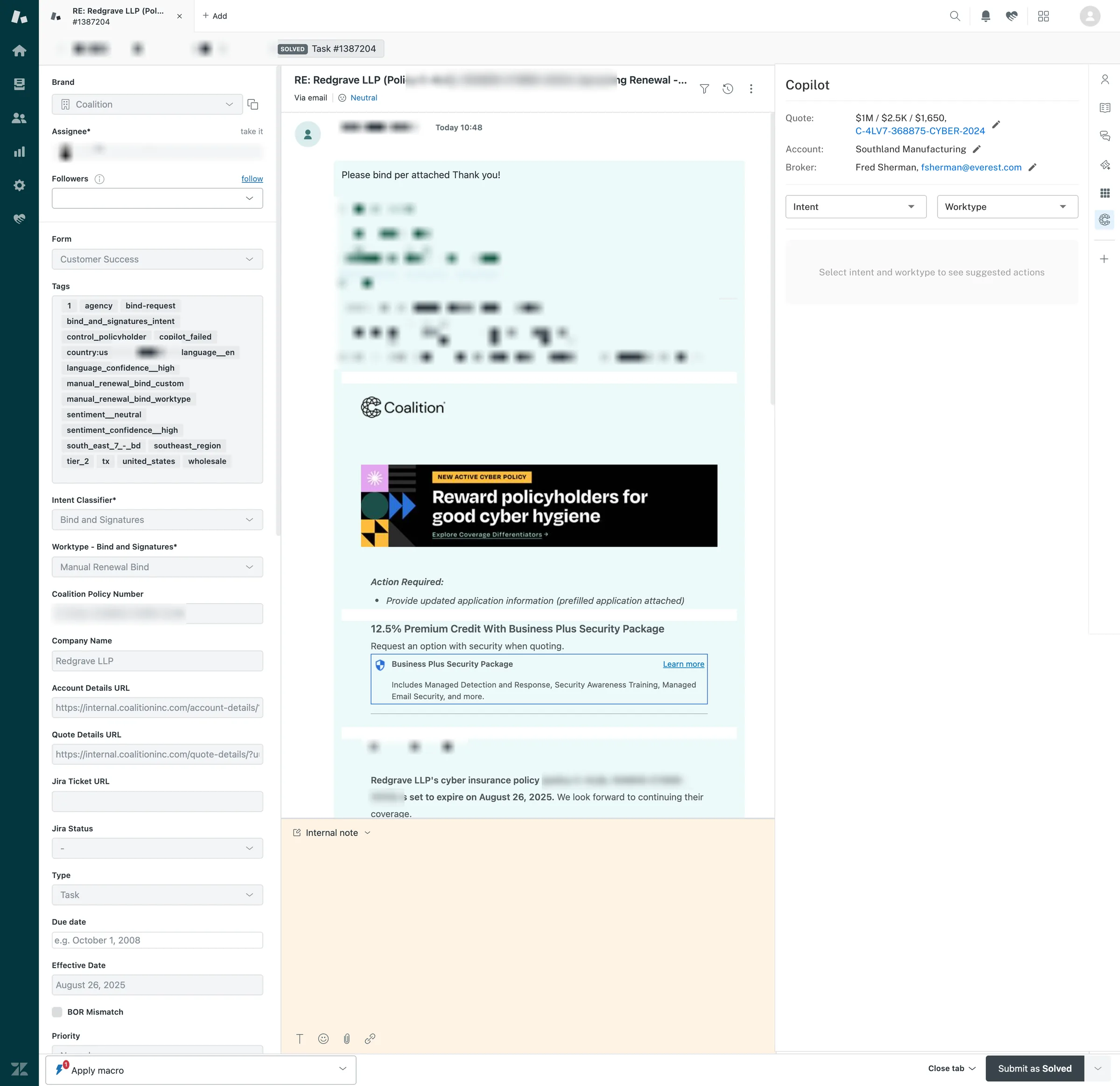
Customer Success Copilot shipped as a side panel inside Zendesk. Usable width, 452 pixels, and no guaranteed height either, because pinned Zendesk apps stack vertically and every team that shipped one took room from the others. Everything the model inferred, and everything an agent needed in order to check it, had to fit in a column narrower than a phone, beside the broker’s email and Zendesk’s own form rail.
That constraint was close to non-negotiable. The premise of the product was that agents should not have to leave the tool they already worked in. Not never: we linked out to internal tools where it genuinely helped, and still do. But every link out spent some of the time saving the project existed to produce, so the bar for adding one was high.
The model was confidently returning the wrong signature
For loss runs the constraint was survivable. The agent’s verification job was to confirm the right account, which the panel could show and the agent could judge at a glance. Signature bundles were not survivable. Once we extended past loss runs, agents had to verify signatures, and the engineer I worked with most closely brought me extraction results that were off. The cause was length: on a long policy document the model was confidently returning the wrong signature. Some states required additional signatures, and field naming and ordering were inconsistent across documents, so a page might carry one signature or two with nothing dependable to tell them apart. His read was that we needed a fallback, some way to put the PDF in front of the agent so they could confirm what had been pulled.
I fixed it in the PDF exporter, not the interface
I did not think the first move was a fallback. I asked whether the problem could be solved before it reached the interface. I also owned PDF design at Coalition, which meant I owned how those documents exported, so I could change the input the model was reading rather than decorate the output it produced. We labelled the signature field explicitly at export, giving the extractor a named target instead of asking it to infer one from position on the page. No legal language changed and no content moved, so there was nothing for compliance to review. I told my legal and marketing partners on Slack and that was the extent of the process. Extraction improved and the issue was not raised as a concern again.
Labelling fixed accuracy. It did not fix trust.
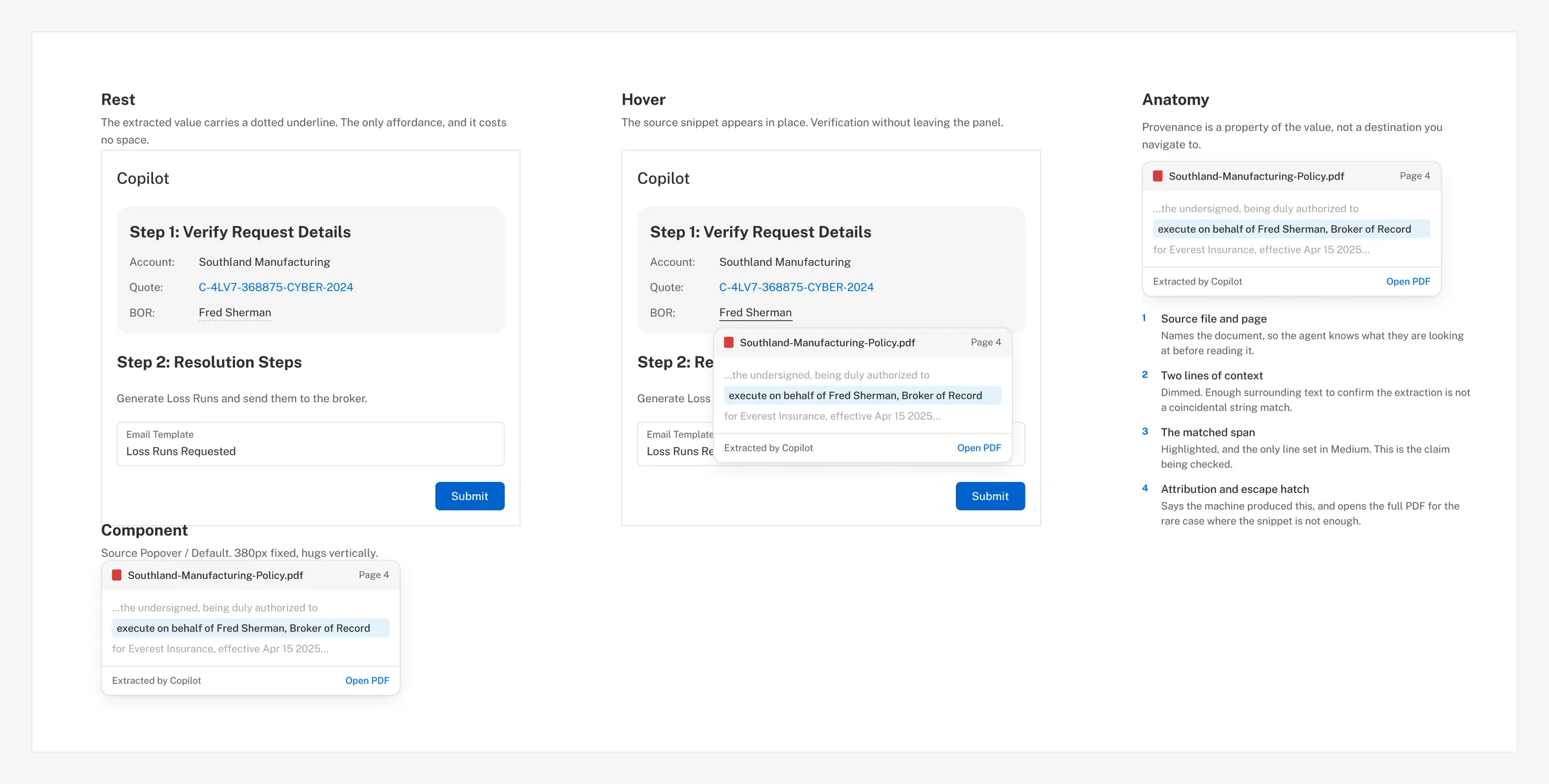
An agent still had no way to see where a value had come from, and I was not willing to ship a product whose core ask was “believe this.” What we landed on, and the piece that outlived this project, is what I now call Hover-to-source: hovering any machine-written value reveals the exact snippet it was lifted from, in place, without opening anything. So the fallback the engineer wanted was still needed, for a different reason than he had proposed it.
Two of my own proposals died on the same 452 pixels
I designed two fallbacks. The first was a pane that slid open with the source PDF. It failed in the most literal way possible: it consumed the panel. I had already killed one thing for exactly this reason. Earlier I had proposed a pop-out for reading long broker emails, and it died because it ate the working area and because the customer success team would not close tabs or overlays once opened, so every one became permanent clutter. The pane was the same mistake wearing different clothes. Two of my own proposals died on the same constraint, which is when I stopped treating it as an obstacle and started treating it as the brief.
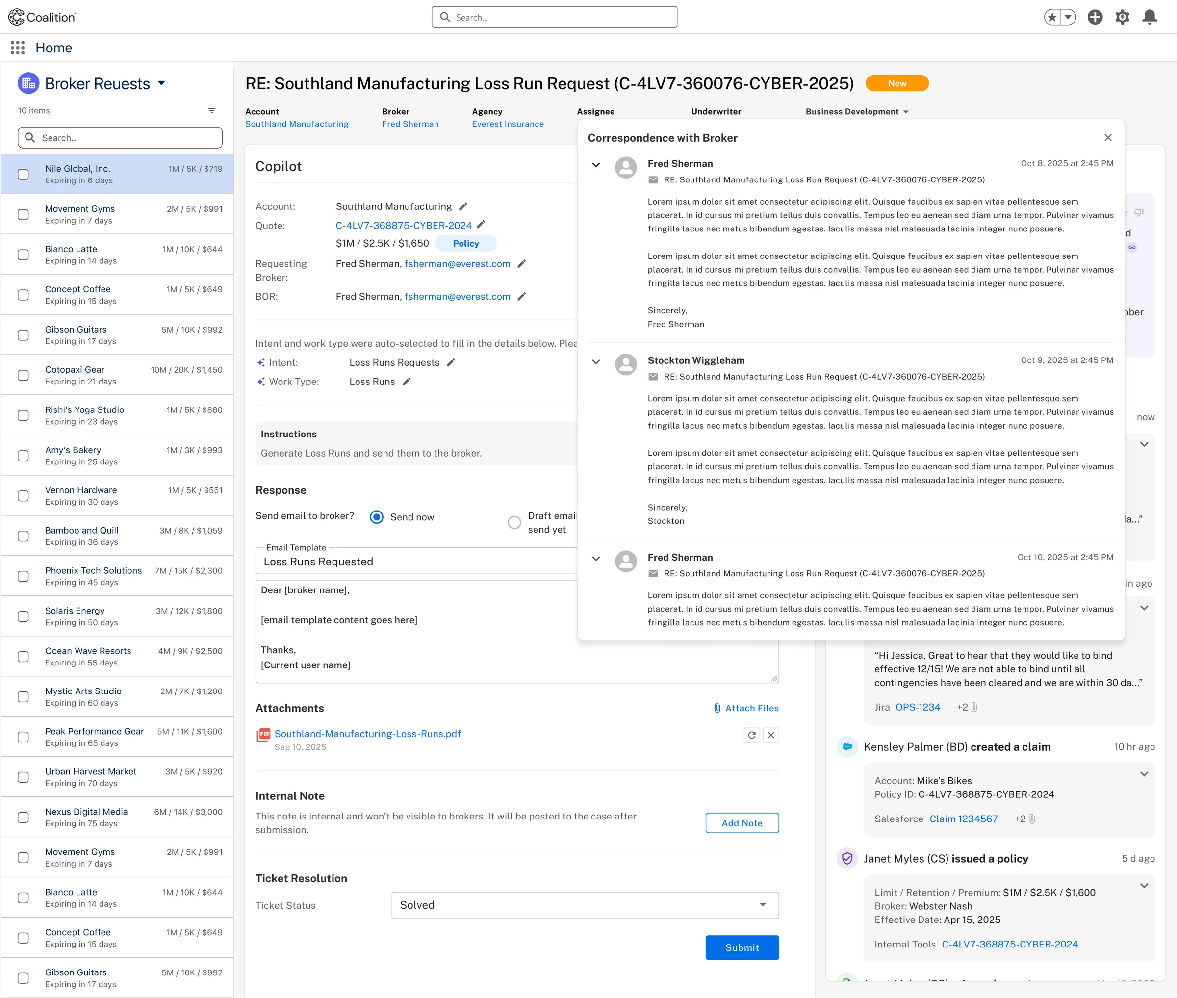
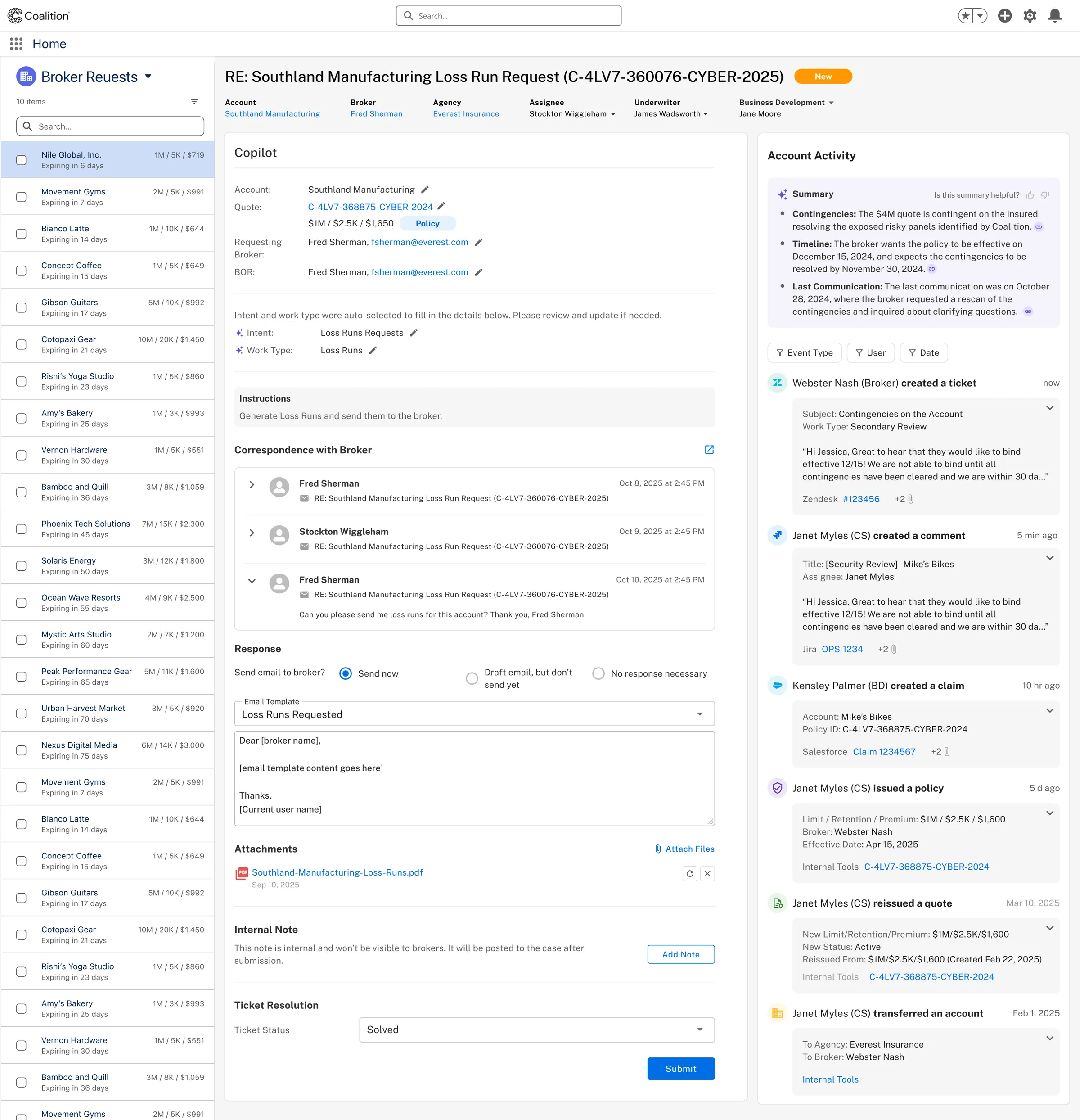
D. Two of my own ideas, same cause of death.
What shipped: chain of custody as a property of the value, not a place you navigate to
Hover. Any extracted value reveals the exact snippet of the source document it was lifted from, in place, on demand. The agent verifies without opening the PDF, without losing the panel, and without leaving Zendesk.
The trade-off was real. Hover is not discoverable, it is poor on touch, and it makes verification optional rather than required. I gave up the guarantee that anyone would check. What I bought was that checking cost nothing, and a check that costs nothing gets done far more often than a check that costs a context switch. That is the same bet the whole product rests on, so it was at least consistent.
When a model is wrong, the interface is the last place to fix it and the first place everyone looks
That is the lesson I would apply again before touching an interface. The signature problem was solved in the PDF exporter. The interface’s job was never to compensate for the model. It was to make the model’s work checkable at a glance, in whatever space I was given.
The postscript I did not expect
Some years on, my engineering manager’s view is that the simplified confirm-only version was arguably the only one we should ever have built. I take that as vindication of the instinct rather than of the timing. The simple interface was the right destination. It was not yet the right product, and building the harder one is what got us close enough to see that.
Support volume grew 50% a year. Headcount did not.
Loss runs were the highest-volume request in the queue and the one with the least judgement in it, which made them the honest place to start.
That is a straightforward margin problem before it is a design problem: every additional thousand tickets a month either degrades service levels or adds people. Leadership framed the goal as letting customer success scale volume without scaling headcount linearly, while improving response times rather than trading them away.
Loss runs were chosen as the first target because they were the cleanest mechanical case in the queue, not because they were the most painful. About 1,500 a month, roughly 10% of all tickets, spiking to 2,400 in a heavy month. Five minutes of agent time each, spread across seven steps in tools that did not talk to each other. Automating them removed an estimated 700 to 1,000 tickets a month from the queue on its own, and more importantly it created a template for everything after it.
Sole designer, discovery through launch and two years of expansion
I owned the interaction model, the runbook pattern, the trust boundary, the panel architecture, and the microcopy. I worked directly with one machine learning engineer, the platform engineers, and a PM, and I reported to the Head of Design and the Chief Product Officer.
I also helped define the success criteria the program was measured on, which is not a thing designers are usually invited to do and is the part of this project I would point at first. It is also the part I got wrong, and the reflection at the end is about that.
Two things I did not own: the model itself and the underlying pipeline architecture. I shaped what the model was asked to produce and what the product did when it was wrong, which is a different job from building it, and I try to be precise about the difference.
The real problem was not automation. It was whether to trust one specific proposal.
The assigned problem was “automate loss runs.” The actual problem was narrower and harder to state:
An agent needs to decide whether to trust a specific machine-generated proposal, in under a few seconds, without leaving the ticket, and the cost of trusting a wrong one is a broker receiving an incorrect document.
That framing is testable in a way the brief was not. It names who is affected, where the decision happens, what has to fit in the available time and space, and what failure looks like. Every design decision that follows either serves that sentence or it does not.
Three constraints were fixed going in. The panel width, which I have already spent a section on. The tool boundary: agents work in Zendesk and any solution that moves them out of it spends the time it was built to save. And a limited internal model, where engineering did not want to spend unnecessary calls on work that might fail anyway.
The last one shaped the interface more than it looks like it should have. It is why the runbook is a stepper rather than a single generated block: decomposing the work into discrete verifiable steps meant a failure at step two did not waste the calls for steps three and four, and it gave the agent somewhere specific to look when something was off. A structural constraint from engineering became the organizing logic of the UI.
The five minutes was never thinking time. It was seven context switches.
I did not come to this cold. I had spent years on the internal tools these same agents used, including the quoting redesign, which meant I had the relationships before I had the project. I had spent time in the Provo office with the customer success team and I ran the testing sessions myself. When I say the team would not close tabs or overlays, that is observed behaviour from watching them work, not a usability heuristic.
The decisive finding was about where the time actually went. Five minutes per loss run is not five minutes of thinking. It is seven context switches, each cheap on its own, and the reason the task felt heavy was the switching rather than the judgment. That reframed the target. The product did not need to make agents faster at the task. It needed to collapse the task into one place, and then the speed followed.
What the AI claims sits in a box. What the human does does not.
Separating machine assertions from human workspace let agents scan for the one thing worth checking instead of re-reading the whole panel.
The interface makes a visual distinction between assertions and workspace. Everything the model has concluded lives in a filled, collapsible grey card headed “Step 1: Verify Request Details.” Everything the agent does sits on plain white. Contain what the AI claims, leave the human’s area uncontained. The heading verb is “Verify” rather than “Review,” because review is passive and verify names an action with a right answer.
Confidence scores existed, and I kept them out of the panel
The system produced them. copilot_failed, language_confidence__high, sentiment_confidence__high all existed as ticket tags. I chose not to surface them to agents. A confidence score invites people to trust the machine’s self-report instead of the evidence, and a model that is confidently wrong is exactly the failure mode we already had. I would rather an agent glance at a source snippet than read a number the model assigned itself.
How much the system does on its own depends on the request, not an on/off switch someone flips.
The system only handles a request on its own when three things are true: the request names a specific policy and the customer’s policies all live in one place, the records stay clean even when a policy changes hands between agencies, and the person asking is clearly the right person to ask. That covers roughly 55 to 70% of loss run requests. Everything else goes to a person. Writing those three conditions down is what let us widen the scope later without arguing about trust all over again.
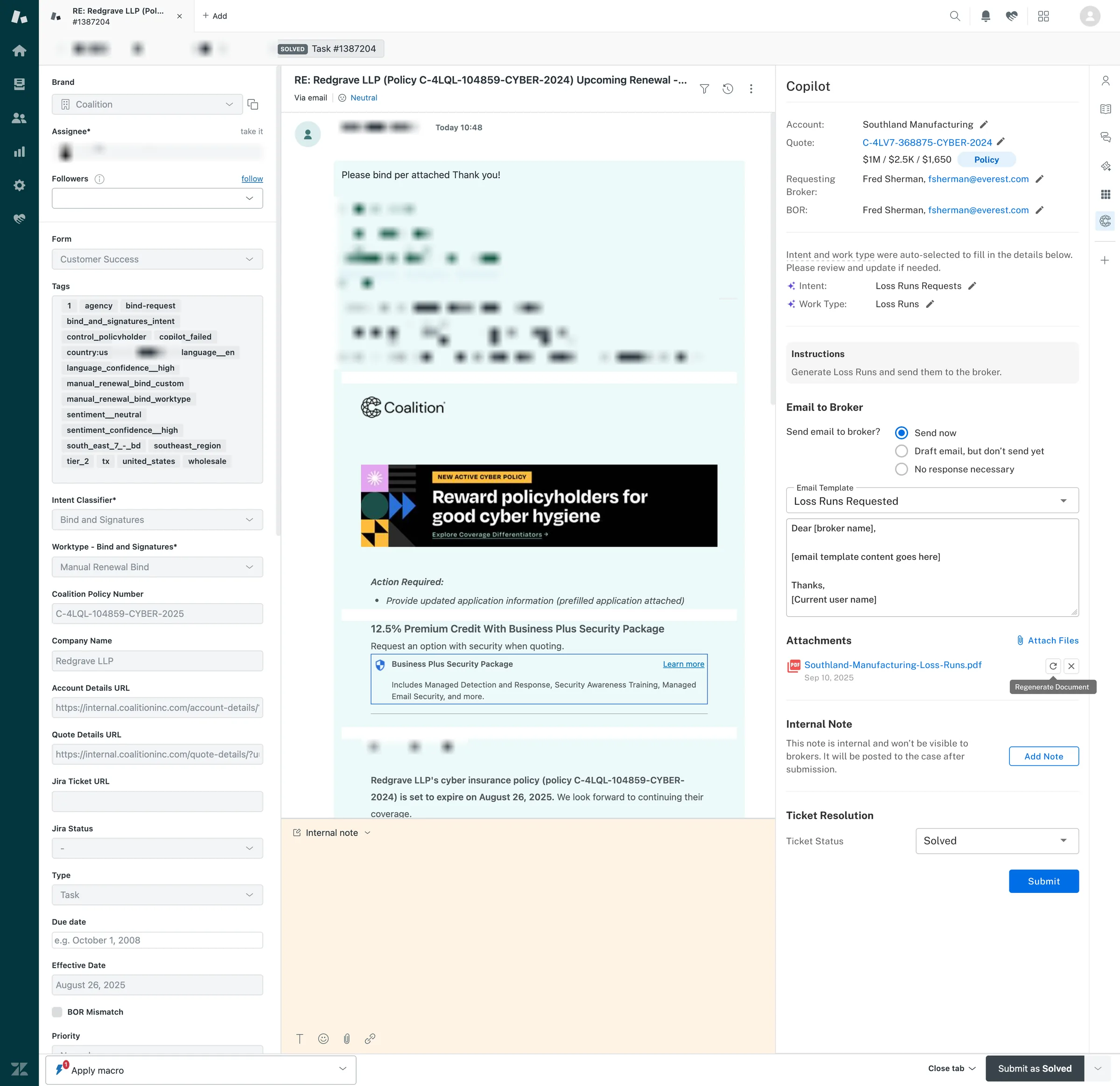
Where I lost one: auto-selecting intent
The PM wanted intent and work type auto-selected rather than left for the agent to confirm, because he was not confident the context would survive otherwise. I would have preferred confirmation as an explicit act. He was closer to the failure cases than I was and I took the call. It is the decision I am least settled on and I would look at it again with the data we now have.
Designing the failure path as a real path, not an error state
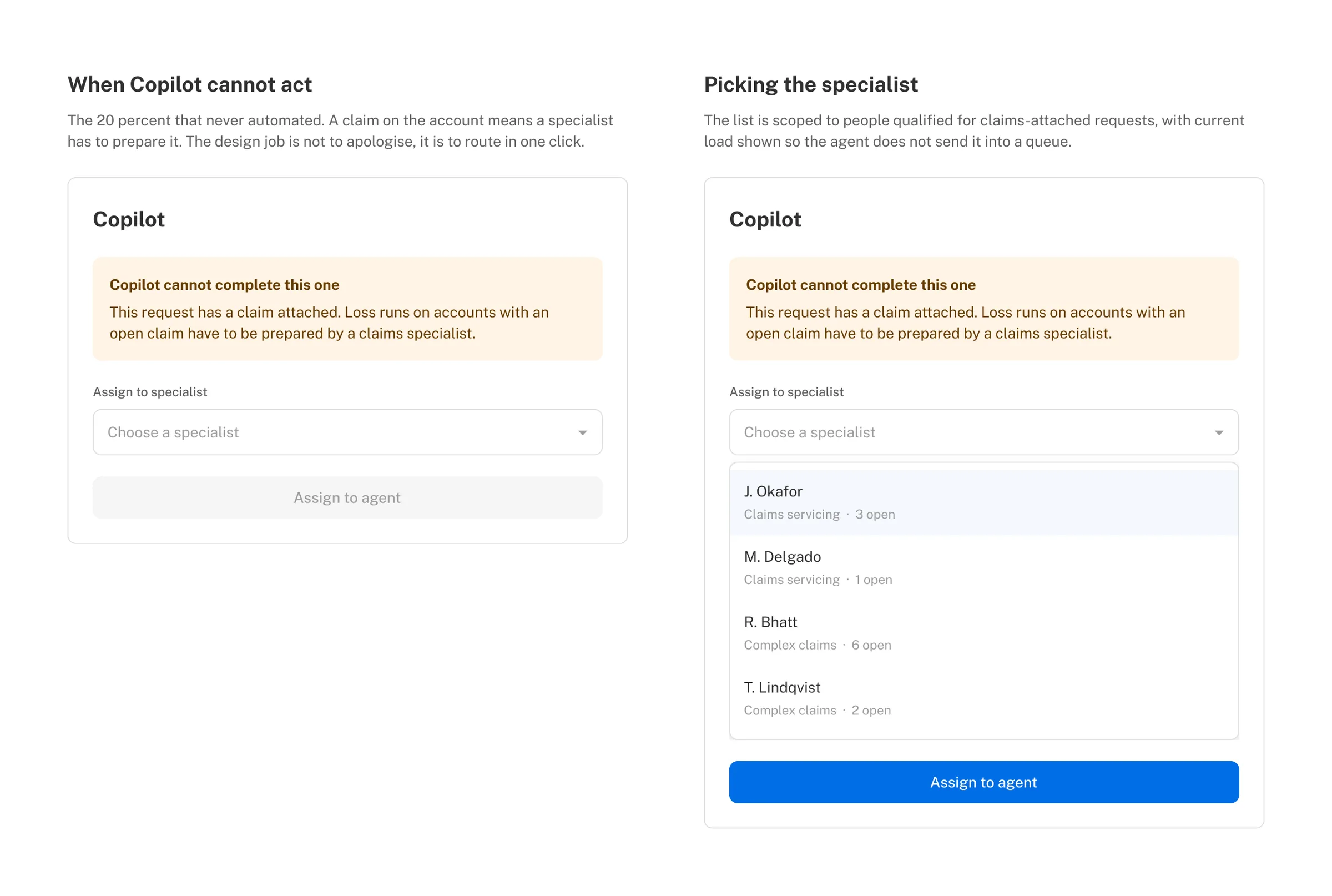
The 80% acceptance rate was the number at launch rather than something we climbed to, which meant the interesting design work was in the remainder. It split cleanly in two. Some were account matching problems, where the request could not be tied confidently to one account, and those got a dedicated search and disambiguation flow. The rest had a claim attached, which needs a specialist rather than better matching, so those route out: a dropdown of specialized users and an “Assign to agent” action.
A tool that works four times out of five and dead-ends on the fifth teaches people to check it manually every time. Designing the fifth case as a route rather than a wall is most of why agents kept using the product.
What would not have happened without me: the upstream PDF fix
Nobody else was looking outside the interface for the cause of an interface problem, and I was the only person who owned both the exporter and the panel.
The hover pattern crossing into claims is the second. I was also the designer on the claims workbench, which had the identical shape: extracted values from long invoices that nobody would open a document to confirm. I took it to that team and their PMs as reuse of something that already existed and worked, which was an easier conversation than a new pattern would have been, though claims had never used Copilot at all so I had to demonstrate the product before I could demonstrate the pattern. Labelled fields and hover to source now run in both verticals. The broader runbook and containment model went further: it now runs in three teams, customer success, claims and the underwriting workbench, with the other two building their own AI features on it.
I worked the trust boundary jointly with the machine learning engineer, and the eligibility criteria came out of that back and forth rather than from either side alone.
65% at peak, and what happened to the number when coverage expanded
to 0.25 min
Loss run automation reached 65% at its peak. Across the two years since, the blended rate sits near 50% as Copilot expanded into bind requests, broker documents and quote changes, so the percentage fell while the volume it handled rose.
The pattern generalized to bind requests, signature bundles and renewals. Measured against control groups: bind requests down 32% on one-touch tickets and 22% on multi-touch, signature bundles down 37.3% and 61.2%, quote changes down 27%.
The runbook and containment model behind that panel now runs in three teams: customer success, where it was built, plus claims and the underwriting workbench, each building their own AI features on it. Hover-to-source itself crossed into claims, on invoices.
“Oh my goodness! That was so easy!”
The reaction I keep, from launch day, captured on video while the team was using it for the first time.
The way I chose to measure success did not work
I folded product measurement and model evaluation into one metric, and it quietly counted the AI as wrong every time an agent simply moved on.
I set up how we would measure success at the same time as designing the product. The main number was how often agents used the AI’s draft as-is, how often they edited it, and how often they ignored it. When someone changed the draft, we asked them why. The idea was that all those small corrections would pile up into a record of what the AI got right and wrong, so the product would grade itself as it went and we would not need a separate effort to check it.
That idea did not hold up, and I would not do it that way again.
When a draft was not quite right, agents did not fix it. They skipped it and moved on, which was the sensible choice: fixing it cost them time and gave them nothing back. So “ignored” ended up meaning two completely different things at once, “the AI was wrong” and “this was not worth my time,” and it counted the AI as wrong plenty of times when it had actually been right. On top of that, we were asking people using a time-saving tool to spend time helping us train it, which works against itself. We had already learned that lesson once, trying to collect reasons when agents turned business away.
The fix is to separate two things I had rolled into one. What the product records should tell you whether people use it and how, and it can do that honestly because it asks nothing extra of them. Judging whether the AI is actually correct needs its own set of checked examples, with real time and people behind it. Using the first as a stand-in for the second was convenient and wrong.
I still think “used as-is, edited, ignored” is worth tracking. I would just stop calling it a measure of how good the AI is and call it what it really is: a measure of whether people find the output worth using.
Two other things I would change
The early wins came from the straightforward requests, and I underestimated how long the messy ones would take. Attachments, renewals, several quotes at once, odd start dates and policies rewritten mid-term each needed their own round of work, and full start-to-finish automation is still only partly there. I would build the messy cases into the original plan instead of treating them as clean-up afterwards.
The harder problem turned out not to be how many cases we covered. It was getting people to reach for the tool every time, not just on the tickets they already expect to be easy, even though it is right four times out of five. I would have designed for that habit from the first release instead of assuming a good tool earns it on its own.
Designing for the model being wrong
The AI product. The substance of this project is what happens when the model is wrong. The runbook exists so a wrong answer is visible before it is actioned. Hover-to-source exists so checking costs nothing. Confidence scores were deliberately withheld so agents verify from evidence rather than from the model’s opinion of itself. Eligibility criteria exist so autonomy expands deliberately rather than by default. And the signature fix is the clearest statement of the whole approach: when a model is wrong, the interface is usually the last place to fix it and the first place everyone looks.
Measuring AI design quality. I defined what quality meant for this feature, and the definition was half wrong, which is the part I would want to talk about longest. Time saved measures the system. The proportion of proposals a human uses without changing anything measures whether the design earned trust. What it cannot measure, and what I asked it to, is whether the model was right. That distinction took two years and a correction from my engineering manager to see clearly, and it is the thing I would bring to the next AI product on day one.
Designing with AI. Not on this project, which predates most of the current toolkit, but on the work that followed it. I now prototype daily in Figma, Cursor and Claude, including a sandbox package inside Coalition’s production repository that runs full screens against real-shaped fixture data through the live provider tree and design system, with unit tests, so interaction decisions get tested before anything is wired. Design-authored pull requests ship against the production codebase. Figma approached me as one of the top AI users on my team.
Next case study
Rebuilding Coalition's quoting flow so a new market stopped needing a new screen
The largest internal product launch in Coalition's history, and eight international markets have launched on the same flow since.